Monday, 31 March 2014

White with Latte

Hi again,

Gosh, I don't post for a week then I post twice in two days! I had to post this one today cos it's for White With 1 and the entries close today! The colour this month is Latte. (My other post for Scrappy Chat Designs is below).

In keeping with my self-imposed WW1 rule of using the colour in the title as well as the theme of the page, here's my layout:


I don't drink coffee but my hubby makes up for me. I think the other love in his life is his coffee machine! Most people agree he makes a mean coffee and when my parents come to visit they usually time it around coffee time.

Apart from the colour and theme, I've made several visual references to coffee on this page. The background is designed to look like milk and coffee swirling together. I used a mix of chocolate Dylusions inks spray and water to create a brown, swirling effect then sprayed white Dylsuions over the top. I let these merge together. I then used various lids, ends of pens etc, to create the 'froth'. I did this by stamping the lids in water then onto the page so the water took away the Dylusions colour leaving the bubbles.


The third coffee reference is the decoration above and below the photo. I used a TCW feather stencil to create that pattern that they put on the top of coffees at cafes. John doesn't do this I must add!


And a close up:


The chippies on the page are all from Dusty Attic and they are covered in Tinby Metallic Melts which will be available very soon.


I'd like to say that I've had a huge scrapping month and thought I wasn't going to get a WW1 layout made in time this month. Lizzy Hill kept pushing me though and somehow enough time was freed up for me to do it, albeit at the very last minute! Thanks Lizzy!

Cheers for now.

Heather

Sunday, 30 March 2014

Inky Business

Hi there. I hope you've got the rain that we finally got. Except you Queenslanders - I don't think it's stopped has it?

I've been working with the March kit from Scrappy Chat designs. What I love about Scrappy Chat Designs kits is that there are always new and interesting products in them. It was the Izink that took me by surprise in this kit. I had never used it before. I had a bit of an experiment with it and the background I used on this layout was actually my 'leftovers' one. I'll explain what I mean.

Firstly, the layout:


I cut up that gorgeous Heidi Swapp paper to use as a black border for a number of the elements. The strips behind the photo and the large banners are made from the Pink Paislee 6 x 6 paper pad and I punched the leaves from the Heidi Swapp paper with a leaf punch.

Now this might sound strange but first I'm going to show you how I made the background that I didn't use! You might like to give this a go. Here's the background:


First I sprayed water all over the cardstock. I then dripped on the Izink then sprayed water over the top again to make the Izink swirl and blend. This worked really well but the Bamboo coloured Izink turns yellow when it's wet. I then just dripped on some more Izink and didn't spray water on to add more of the green colour. I dried this off with a heat gun and was pretty pleased with it.

I decided to try to colour one of the doilies with Izink so I mixed the Izink with some water in a spray bottle. Knowing that the doily would create a nice pattern when I sprayed it, I did this on the other piece of white cardstock. I then realised I had way too much Izink on the doily so I turned it over and stamped over the cardstock with it. I decided that I liked this as a background more than my first one so I used this instead.

I was very excited when I saw the Stains stamps in the kit. How cool are these? I used mine to stamp with blue ink, then I used my Metallic Melts on them. I love this combination!


I made flowers out of my sprayed doily. I cut out the solid centre then tore the remaining patterned part of the doily in half lengthways. I then just pleated the paper in my hand to form a flower shape and put a brad in the middle. This made perfectly co-ordinating flowers for my page.


After Sandra came up with so many amazing ideas for that paper wire I felt I had to be extra creative too! I formed mine into a stylised banner string and sprayed it black with Dylusions ink spray. I love this paper wire. It's so versatile. I can see myself using this again and again.


I coloured my word sticker with ink and added sequins across the page. There was still plenty of room left for journalling.

I hope you get a lot of enjoyment out of this month's kit. If you don't have it, you can take a look at it here.

 Happy scrappin' everyone!

Heather

Thursday, 27 March 2014

A Quick Update

Hi there,

I'm so sorry I haven't been too active on my blog lately. I've had so many DT and magazine commitments this month that I just haven't had the time to keep up online. Anyway, I've just about met most of my deadlines so here's a quick update.

These are two layouts that I made for my article on White Cardstock, White Space for my Workshop Secrets article in Scrapbooking Memories magazine Vol 16, No 8. I think we all have our favourite layouts and both of these are faves of mine.


It was a challenge to get that washi to stay in place during postage to the magazine but it made it!


I loved how this one came together. The whole page has only three colours on it. I think I should use book paper more often cos I really enjoyed using it on this one. Oh - and there's my favourite stamp again!


 Happy scrappin'!

Heather


Monday, 17 March 2014

A Smorgasbord of Chipboard

Hi there,

It's currently raining here which is a pleasant change. Hope you got some rain too.

For something different, I've been busy making cards instead of layouts. I've gone into a chipboard frenzy with these! I've layered all sorts of chippy shapes and topped the final layers with Tinby Metallic Melts for a cool finish.

Here are the cards:


Starting from the back layer, I used Dylusions ink spray on cardstock. I then added white spray-painted Dusty Attic chipboard backgrounds. On top of that are various Dusty Attic chipboard shapes which I have either painted, covered in paper or added Metallic Melts to. A list of the individual products is listed below.

I have used the following Dusty Attic chipboard on all the cards:

Banners #1 DA1022

Scribble Hearts DA1019

I also used Soot and Alabaster Dusty in Colour paints and Clear Gloss Varnish. The Metallic Melts colours are Patina and Carbon.


"50"
Products used as well as those already listed:

Number Panel Small DA1051

Speech Bubbles DA1067

Number Grid Large
DA1061
(I cut the number '50' from this)


"21"
Products used as well as those already listed:

Number Grid Small DA1071

Photo Props DA 1056

(The number '21' was cut from the large Number Grid)


"hello"
Products used as well as those already listed:

Mini Trellis DA1033


"bon voyage"
Products used as well as those already listed:

Around the World DA1036

Mini Hot Air Balloons DA1069

Him & Her Border DA1065


I hope these cards inspire you to make your own. Chippies are fabulous on cards!

Happy card makin'!

Heather


Thursday, 13 March 2014

Sweet Dreams

Hi everyone. I'm here to share my third layout using the Soaking It Up kit from Scrappy Chat Designs. I used the dreamcatcher as the inspiration for this layout. And with all the lovely pink girliness available on the sticker sheet I couldn't resist using a photo of my niece fast asleep.


I added some feathers from the sticker sheet to the dreamcatcher and made it look like they were wafting down. I love all the arrows and chevron shapes on the sticker sheet too. They can be used on just about any layout.


To make the over sized chevrons, I cut part of a large zig zag shape to a chevron then cut the chevron into three long, skinny ones. I also used the sheets of washi in the simplest way by just tearing strips off. This suited this layout but there are so many other ways you could use this.

Well I have loved working with this kit. There are so many extras that are such fun to play with and some, like the stencil, can be used over and over again.

Happy Scrappin'!

Heather

Monday, 10 March 2014

Family Glam

Hi there. It's been a busy week this week, both on the scrapping front and the home front.

Scrapping wise, I've been working on some layouts for Scrap Everything. Katherine sent me the most gorgeous products to work with. I made the layout here using the stunning Peacock Feathers papers from Fabscraps.


The feather is also from Fabscraps. I coated it with a Pearl Pen, available here then added gold and silver Metallic Melts, a kind of embossing powder that I adore, to the tips and centre. I used glitter glue to make the dots.


Don't you just love that zip? It's another Fabscraps product. You can cut it to any length which is so handy and you get two zipper pulls in the pack. I fussy cut flowers from one of the papers and filled the open end of the zip with them.


To make those 'cabochons' I took some of the French Heritage stickers and attached them to cardstock. I cut them out and applied a thick layer of Glossy Accents to the centre to create that raised effect. You can keep layering Glossy Accents (after each layer has dried) if you want to raise that centre higher.


I made the flowers from the paper as well and those little dragonfly brads are from my stash. They're really old but I thought they worked well here.

Thanks for taking the time to look. I hope you've gained some inspiration!

Happy scrappin'!
Heather

Thursday, 6 March 2014

Wild & Free

Hullo there. I hope your week has been a good one so far.

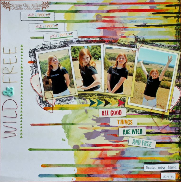
I have my second layouts made using Scrappy Chat Design's new Soaking It Up kit to show you. Some of the papers in this kit are from Glitz Design's Wild & Free range. In my layout, the name of the papers became the name of my layout.


Included with the kit this month is some coloured wire which is fortunate as it's exactly what I needed to make the title. I copied the font and design of the brand name.

Here it is up close. I've put this pic in sideways so it's easier to see.


It was really easy to make the words as the wire is so soft to work with. If you've never worked with wire before then I've put a brief step-by-step on my post on the Scrappy Chat Designs page.

The hardest part is attaching the letters to the page. You'll need to use a clear drying glue with a fine nozzle. It's also an option to stitch or staple it to the page, depending on what your design is and what you're attaching it to.

In the picture below you can see the brand name design. I've added three of them to the page to reiterate the Wild & Free theme. One of the Kaisercraft stamps that are also in the kit was perfect for forming the row of triangles under the name.


I also used the wire to form some hearts and used the heart from the sticker sheet as well. The borders around the photos are made with one of the stamps. I just inked up only the parts of the stamp that I wanted to use and carefully stamped around my photos. If I was only using one photo I would have done my stamping before I adhered the photos to the page but this was a bit tricky with four photos.


I used a third stamp, again one of the ones in the kit, to create the black drip marks on the right of the page. I wanted to accentuate the look of the page fading from dark to light as you look across the page. I used the wood grain stamp to add a black border to the right hand side then I took the drippy stamp, inked it in black ink, than applied it at random spaces and lengths along that edge. This gave the effect of more paint drips adding to what was already on the paper.

I love this 'drippy' paper and wanted to show it off. It's also quite a busy paper so I kept my embellishments to a minimum to allow the paper to shine.

Thanks for joining me.

Happy Scrappin'!
Heather