Showing posts with label Twiddleybitz. Show all posts

Thursday, 24 October 2013

All That Glitters

Hello again,

I'm back with a share - this time it's cards! I had these cards published in last months' edition of Australian Cardmaking, Stamping and Papercraft.


I went all out with the glitter on these. Together with the ruby, black and gold colour combo I think it makes a striking statement. The paper is Bo Bunny Serenade collection, the chippy leaves are from Twiddleybitz and Scrapmatts and the flowers are from Manor House Creations. I used two different American Crafts glitters on the leaves.

Here are close ups of the individual cards:


For full instructions on how to make these cards, grab a copy of last month's Australian Cardmaking, Stamping and Papercraft magazine.

While you're there, take a look at the new edition that just came out - I'm in there too! I've made some Christmas cards with a modern edge to them.

Here are some sneak peeks:


If you're making your own Christmas cards this year I hope you're well into it. Have fun!

Heather

Tuesday, 10 September 2013

Australian Cardmaking, Stamping & Papercraft

Hello there.

I hope you had a great weekend. I did! We had the last official day of our Masters Tour at Werribee on Saturday. They were an awesome bunch of ladies and we had a ball. I'll get some pics together soon. On Sunday I accompanied my die-hard Tigers fan hubby to the footy. There were 95,000 people at the MCG. We didn't win but I still had a blast. What an amazing atmosphere!

To top it off, my copy of Australian Cardmaking, Stamping and Papercraft arrived in the mail today and I've got some cards in it! It's the first time I've submitted cards to a mag and I must say that Emily at ACSP was terrific to deal with.


You can find the website here.

Here are a couple of sneak peeks:


For full instructions on how to make the cards, grab a copy of the mag. It has just been released and should be arriving into the stores any day now.

I hope you can fit in some crafting time soon.

Heather

Monday, 1 July 2013

Exciting News!

Oh hello everyone! I'm thrilled and honoured to be asked to be a Guest Design Team member for The Scrapbook Store. Suzanne and Marelize are such wonderful ladies and their design team has some of my all-time favourite scrappers ever, so I'm thrilled to be working with them for the month of July.

I thought I'd start with the monthly sketch challenge. Here's the sketch:


I had some pics of my daughter wearing steampunk clothes to her year 12 formal which I wanted to use. I really admire my daughter for her unusual tastes in clothes and the way she's not afraid to get out there and wear them. I figured there mustn't be too many teenagers who can figure out how to wear steampunk to a formal event. I think she pulled it off beautifully!

Even though the sketch is quite soft and pretty I figures I could adapt it. I flipped it vertically and dropped the top circular element as my page was getting quite heavy visually. There was a cluttered background in my pics so I photoshopped the background out completely. The blank background on the new photos allowed me to have a fairly busy page as the photos stood out quite clearly.

Here's my layout:


The background is made from the leftovers of other backgrounds. I was using Dylusions ink sprays through a The Crafters Workshop stencil for some other projects and every time I finished, I flipped the stencil over and stamped it onto cardstock. I did this a number of times onto the same cardstock and the result is this background.


I also used Dylusions to colour the chipboard and the flowers. I used to spend ages hand-painting chipboard until I discovered Dylsusions! The Scrapbook Store sells a whole range of Dylusions ink sprays here and The Crafters Workshop stencils here.


I attacked my stash from a class I did with Finnabair and found all those yummy screws and cogs. They're perfect for this page! I added some small Manor House Creations flowers along the bottom, colouring them with Dylusions.


To lighten and brighten the page, I added the bright pink flowers. I love the juxtaposition of this splash of girliness against the steampunk setting but my daughter doesn't like it. She's the steampunk expert and she thinks the pink flowers shouldn't be there. This raised a whole new issue - who do I make pages like this for? Are they for me or the people they're about? Should they contain what I like or what they like? I haven't been able to answer this question yet but the flowers are still there!

Hope to see you over at The Scrapbook Store soon!

Heather


Wednesday, 8 May 2013

Scrap Around The World


Hello all,

The ever gorgeous Helen Tilbury in South Africa has started up a new challenge site called Scrap Around The World. As the name says, it's a global site. The Design Team are from many different countries and the challenge is open to anyone around the world. I found out about it through our very own Leonie Neal-Dawson who is on the Design Team.

The very first challenge is up now and I just had to join in! Here is the first sketch and moodboard:


My first reaction to the moodboard was that I love that turquoise colour. The other items that attracted me were the beads and the different textures. I got super-inspired by all this and made two very different layouts!

Here's the first:


I adore these photos of my daughter hamming it up for the camera and I thought they went well with the sketch. I used that yummy turquoise colour from the moodboard and stuck very closely to the sketch. I rarely use sketches so this was a fun experience for me!

The main change I made to the sketch was to add extra flowers, particularly beneath the photos. I used four different flowers from Manor House Creations. Aren't they gorgeous? That KaiserCraft butterfly finished the flower cluster off nicely. Here's a close up:


I used a mixture of tags and die-cut shapes to make the row of tags indicated on the sketch and replaced the large block of chevrons with some banners tipped on their sides to create the arrow shapes.


The fabric in the moodboard inspired me to add some ricrac around the circle. I couldn't resist those beads and added a mixture of turquise, black and clear beads on top of the circle as well. This was great for adding a bit of texture and interest. I also added some turquoise beads to the centre of some of the ink splashes.


I had to put my two layouts on separate posts to go on the SATW site so the second one is below.

Heather

Scrap Around The World - second layout

I wanted to make my second layout very different to the first one. I only used the sketch quite loosely this time. Due to the orientation of the photo, I flipped some, but not all, of the sketch elements to the other side of the page. Here's the layout:


Again, I picked up that gorgeous turquoise colour - cos I love it! I kept the circular element on the same side as the sketch but flipped some other parts. I started my page with the texture concept from the mood board, using gesso, texture paste, paint, stamps and Dylusions ink spray. The chevrons on the sketch inspired me to use the triangular template.
I really wanted to get more fabric into this one plus I didn't really have room down the side for the tags. My solution was to convert the tags into a banner then hang it under my photo. I was then able to incorporate all sorts of fabrics to make my banner pieces. I added a few charms as well.  Here's a close up:


Still inspired by the beads, I added some large, clear ones (I can't remember what they're called!). I also like the shabby look from the moodboard so I left long tails on my stitching. I also tucked some muslin behind the photo and added some Webster's Pages trims around the page. I had to move the title towards the centre of the page for balance.


Well that was a long couple of posts! If you're still with me I hope you enjoyed it!

Happy scrappin'!

Heather

Thursday, 14 March 2013

A bit of Dylusions love

I have a confession to make - I'm a Dylusions addict! I keep finding more and more uses for those little bottles of colour explosions!

Here's a more subdued page that I made recently:


I went for more earthy tones to suit the pic and sprayed two of the Manor House Creations flowers with Dylusions to match. I inked the large Twiddleybitz flourish, painted the tips gold and laid it over the sprays.

Here are some close ups:


The lizard inspired me to think about Australian outback themes so I decided to create a dot painting frame around the page to give it an aboriginal feel. To do this I used various sizes of dots from foam lettering, mounted them on the end of a pen then dipped them on a stamp pad. I then used a smaller foam dot dipped in gold paint to accent the larger dots. I used the edge of a chevron stamp to create zigzags to help add to that aboriginal feel.

Til next time!

Heather


Friday, 15 February 2013

My Masters Layouts

Oh I've been busting to get these layouts on my blog! At last I can put them up!

Yesterday, three of the Masters - Beck, Leonie and myself - caught up for the first time. I won't bore you with the details but we all brought our Masters layouts along and it was amazing how much better they all are in real life. I was blown away!

Now this might be a long post. I'm very proud of these layouts so I'll try hard not to rabbit on too much!


I love finding unusual items to scrap with and was thrilled when I found these acrylic flowers, buds and leaves at Spotlight. I used normal wire to form the frame then I simply twisted the wire stems of the acrylic flowers around the frame, after first stripping the stems of their silver foil covering.

Here are some close ups:


I had to ensure the clear acrylic pieces could be seen so I kept the title cluster away from the frame and kept the layout fairly simple for maximum impact. The filigrees and charm are from my2angels.


 To create the letter “A”, I first stamped on it with gesso then coloured it with distress ink. I then coated it with Dimensional Magic. I love the way this gives a multi-layered look on one simple letter.

Next was the canvas challenge. We had to focus on texture.


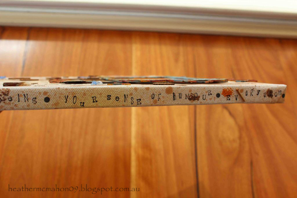
This is probably the deepest I have ever gone in trying to portray feelings on a layout. I was trying to show that I love every part of my son.

I had had my eye on that fantastic rusty tin wall for a long time and this was the perfect layout to use it as a background for my photo. I wanted to extend the rusty tin look further across the page as well as provide a place to add words about my son’s many parts so I printed another photo on photo canvas for added texture then ran lines of glue from a glue gun behind the corrugations.  If you run your finger over the photo printed on canvas you can feel the “ridges” of the tin. 


I added all sorts of things to help create the explosion effect including pieces of broken glass, rusty clocks and rusty pieces of the chipboard chicken wire. The chipboard frames with the chicken wire attached were great Twiddleybitz pieces. There is also paint and my ever faithful Tattered Angels Glimmer Mists.


I didn't want to leave the edges of the canvas blank so I added more words describing all the parts of my son that I love.


The next criteria was to make a layout that included at least 3 photos plus memorabilia. Here's what I came up with.


This is a beautiful story about how my daughter inherited a necklace from a favourite great-aunt. I wanted to keep this layout soft and feminine while at the same time creating a glamorous, vintage look. My aim was to create a jewellery box feel, using pearls and satin as features. Cream was my base colour but the reason I chose the aqua for my secondary colour is because the beautiful Manor House Creations flowers worked so well with it.

The photos sit on a pair of Twiddleybitz chipboard doors which I took from a mini album of theirs. And no, I don't work for Twiddleybitz!

To make the satin “jewellery box” section, I covered foam with satin and secured it with brads topped with pearls. There are more filigrees from my2angels here - and no, I don't work for them either!


Here's the inside:


 My memorabilia is the original newspaper clipping of the wedding photo.


 And last, but certainly not least, is the double. It had to be about our childhood. This is the hardest one to see both in the mag and on this blog. 


This is possibly my favourite. It took me weeks to make!

Here's the first page:


And here's a close up:


My mum had previously given me a lot of her old sewing stuff. Some of the items were priceless – untouched packets of buttons with the price in shillings and pence still on them, 50 year old packets of hooks and eyes, old zips still in their packets and rolls of beautiful lace. When I started looking at old photos of me for this task and saw how I was always wearing home-made clothes, the ideas for the layout just kept coming.

Here's the second page:


Here are some close ups:


 There was so much to tell that I decided to make pockets behind each photo to keep the journaling in. I really wanted to use those old packets of buttons but wanted to keep the layout uncluttered so I made tag clusters, using a button packet at the back of each one. I love the wording on the button packets – “Boilproof”, “Hot irons cannot hurt them”. I also added a tag between the journaling and the buttons, just because there were so many beautiful paper options and I wanted to use them all! 


How cute is this photo?

Here's the three layers of one of the tag clusters:


I hope you've enjoyed reading this. If you still feel the urge to read more about the Masters' layouts, the others Masters are all in the process of putting theirs onto their blogs. Links to their blogs can be found down the right hand side of my blog. 

Have a great weekend everyone!

Heather


Tuesday, 18 September 2012

Scrap Friends Challenge

Hi there.

It's been a little while since my last post. I'm not making any apologies - I had a huge birthday bash on the weekend which took a lot of organising and a lot of recovering from!!!

This is the first layout I've ever submitted to Scrap Friends. You can find their website here. Here is the sketch:


And here's my take on it:


I decided to flip the layout vertically so my nephew's eyes are looking towards the centre of the page. As much as I love the film strips in the original sketch, I don't have any so I just went with what seemed to work.

I adore this photo of my nephew. He looks like a cute little ET wrapped up in his beach hoodie!

I challenged myself to use flowers on a masculine layout. All these Manor House Creations flowers were originally white. You can find their blog here. I sprayed the flowers with Dylusions Ink Spray then gave the background plus the flowers a light spray with Perfect Pearls Mist to give a more grainy, sandy effect. I added the bare chipboard and raw edged hessian to make the layout more boyish.

Hope you like it!

Heather