Oh I've been busting to get these layouts on my blog! At last I can put them up!
Yesterday, three of the Masters - Beck, Leonie and myself - caught up for the first time. I won't bore you with the details but we all brought our Masters layouts along and it was amazing how much better they all are in real life. I was blown away!
Now this might be a long post. I'm very proud of these layouts so I'll try hard not to rabbit on too much!
I love finding unusual items to scrap with and was thrilled
when I found these acrylic flowers, buds and leaves at Spotlight. I used normal
wire to form the frame then I simply twisted the wire stems of the acrylic flowers
around the frame, after first stripping the stems of their silver foil
covering.
Here are some close ups:
I had to ensure the clear acrylic pieces could be seen so I
kept the title cluster away from the frame and kept the layout fairly simple
for maximum impact. The filigrees and charm are from my2angels.
To create the letter “A”, I first stamped on it with gesso
then coloured it with distress ink. I then coated it with Dimensional Magic. I
love the way this gives a multi-layered look on one simple letter.
Next was the canvas challenge. We had to focus on texture.
This is probably the deepest I have ever gone in trying to portray feelings on a layout. I was trying to show that I love every part of my son.
I had had my eye on that fantastic rusty tin wall for a long
time and this was the perfect layout to use it as a background for my photo. I
wanted to extend the rusty tin look further across the page as well as provide
a place to add words about my son’s many parts so I printed another photo on
photo canvas for added texture then ran lines of glue from a glue gun behind the corrugations. If you run your finger over the photo printed on canvas you
can feel the “ridges” of the tin.
I added all sorts of things to help create the explosion effect including pieces of broken glass, rusty clocks and rusty pieces of the chipboard chicken wire. The chipboard frames with the chicken wire attached were great Twiddleybitz pieces. There is also paint and my ever faithful Tattered Angels Glimmer Mists.
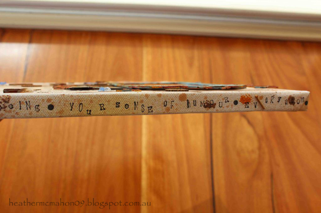
I didn't want to leave the edges of the canvas blank so I added more words describing all the parts of my son that I love.
The next criteria was to make a layout that included at least 3 photos plus memorabilia. Here's what I came up with.
This is a beautiful story about how my daughter inherited a necklace from a favourite great-aunt. I wanted to keep this layout soft and feminine while at the
same time creating a glamorous, vintage look. My aim was to create a jewellery
box feel, using pearls and satin as features. Cream was my base colour but the reason I chose the aqua for my secondary colour is because the beautiful Manor House Creations flowers worked so well with it.
The photos sit on a pair of Twiddleybitz chipboard doors which I took from a mini album of theirs. And no, I don't work for Twiddleybitz!
To make the satin “jewellery box” section, I covered foam
with satin and secured it with brads topped with pearls. There are more filigrees from
my2angels here - and no, I don't work for them either!
Here's the inside:
My memorabilia is the original newspaper clipping of the wedding photo.
And last, but certainly not least, is the double. It had to be about our childhood. This is the hardest one to see both in the mag and on this blog.
This is possibly my favourite. It took me weeks to make!
Here's the first page:
And here's a close up:
My mum had previously given me a lot of her old sewing stuff. Some of the items were priceless – untouched packets of
buttons with the price in shillings and pence still on them, 50 year old
packets of hooks and eyes, old zips still in their packets and rolls of beautiful lace. When I started looking at old photos
of me for this task and saw how I was always wearing home-made clothes, the
ideas for the layout just kept coming.
Here's the second page:
Here are some close ups:
There was so much to tell that I decided to make pockets
behind each photo to keep the journaling in. I really wanted to use those old
packets of buttons but wanted to keep the layout uncluttered so I made tag
clusters, using a button packet at the back of each one. I love the wording on
the button packets – “Boilproof”, “Hot irons cannot hurt them”. I also added a
tag between the journaling and the buttons, just because
there were so many beautiful paper
options and I wanted to use them all!
How cute is this photo?
Here's the three layers of one of the tag clusters:
I hope you've enjoyed reading this. If you still feel the urge to read more about the Masters' layouts, the others Masters are all in the process of putting theirs onto their blogs. Links to their blogs can be found down the right hand side of my blog.
Have a great weekend everyone!
Heather