Hi everyone,
As promised on my last blog, I have tried not to leave it so long between posts this time!
I recently had my first feature in Australian Scrapbook Ideas magazine. The brief was to use A4 papers on 12 x 12 layouts. I was also supposed to keep the A4 papers intact on as many layouts as possible which I found surprisingly hard!
By far my favourite layout of them all was the one where I cut the A4 papers up completely and made stitched circular embellishments with them. Here it is.
This is my bestie. We've been besties for so many years now I don't remember how many! We love going out together and have such a great time. This event was a 60s night and the colours of the costumes were brilliant. I wanted to capture all the psychedelic groovin' that was happening that evening!
I also made another layout of the same evening, this time of the four of us who went together. We were originally supposed to go with our hubbies but a couple of them couldn't make it so the others pulled out. More fool them as it was such a great night! This group of girls are a blast!
Again, I tried to capture all that groovy 60s knock-your-socks off colour. It was just coincidence that we all had hired long white boots so I had to make a feature of this. The fact that I could use the words to "These boots were made for walkin'" was the icing on the cake.
For a complete change of subject I then chose to scrap about a funny thing my son said. Here's the layout:
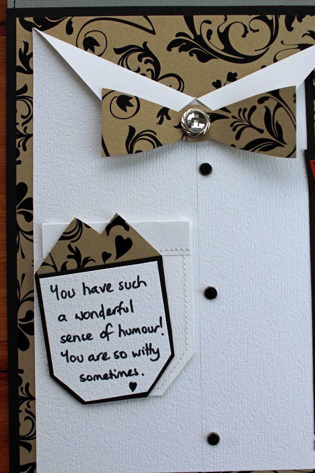
My son has a great sense of humour. I was actually looking for a formal photo to go with this A4 paper but I found this photo when I was looking. I thought it suited perfectly! I had fun making the formal shirt on the left of the layout. I wrote my journalling on the handkerchief then tucked it in the pocket. Here's a close up:
And last but not least is a layout of my mum and her sisters. I fussy cut the flowers in the A4 paper so they formed a floral frame around the ladies. Can anyone work out which is the famous Aunty Shirley from my last blog?
Thanks so much for looking. I hope you all have a great week.
Heather
PS - Shirley's second from the left.
Showing posts with label A4. Show all posts
Sunday, 25 November 2012
Wednesday, 17 October 2012
Scrapbooking Memories Update
Well I've been a bit under the pump lately and haven't updated layouts I've had published in mags for a while. At last I've got a bit of spare time so here are a few now. These are from Scrapbooking Memories Vol 14, no 6.
I had a bit of fun with this one. I used small sticks that I collected on one of my walks to create the twiggy effect. I interlaced them with string and sprays of small flowers. The photo is so rustic and I wanted something to complement it.
I also added a bit of hidden journaling. The journaling isn't personal but I didn't want it showing on the layout so I tucked it behind the photo and added a ribbon and tag.
The next layout was in a very different style. I was really shocked when our son grew to the same height as me. For 15 years I've been looking down at him and suddenly I wasn't!
I really wanted the letters in the word"tall" to be tall and the ones that fitted the best were clear acrylic ones. Clear just wasn't going to work on this page though so I painted the back of them with acrylic paint then stamped on the paint when it was dry. I then outlined the letters with a blue Sharpie pen. The background paper is actually a soft gift wrap paper with a handmade feel.
Note - my son is now 2 inches taller than me. My husband I both look up to talk to him now!
Enjoy your day!
Heather
Friday, 12 October 2012
24/7
Hi all,
Well it's back to winter here with rain, hail and a maximum of 7 degrees today. And that was without the wind chill factor! Never mind - it's great scrapping weather.
Here's another layout for Scrap Everything! I've used more of the Simple Stories range. There are a lot of fans of this product out there!
For something different, I opted for an A4 layout. I love using A4 pages in a rounded-corner, retro kind of way. Here's the layout:
I had a bit of fun with the photo. Using Photoshop Elements, I put a bit of a red tint onto it then ran a mosaic filter over it to give it that crackled look. Here's a closer look at the photo.
There are so many options for titles when using calendar pages on your layout. I went with 24/7 but there are so many more I could have used like All Year Round, Day In Day Out, Every Minute/Hour/Day etc, Until the End of Time and so on.
Here's a close up:
Hope you have a wonderful weekend.
Heather
Subscribe to:
Posts (Atom)


.jpg)
.jpg)
.jpg)


