Thursday, 27 February 2014

Wild & Free

Hi all. I've been playing with the new Soaking It Up kit from Scrappy Chat Designs. Wow! I love this kit! It has papers from the stunning Wild & Free range along with coloured wire, a stencil, sequins and a new Metallic Melt made especially for this kit. Plus the most wonderful set of stamps ever! I used all four stamps on my first two layouts and I will be using these HEAPS in the future.

I'm the lucky one who gets to make three layouts with the kit this month so here is my first one:


This page was lots of fun to make. To start, I laid the stencil over the background cardstock and sprayed it with acrylic paint mixed with water. I used Dusty in Colour paint but any water-based paint will do. I moved the stencil around the page to spray the areas I wanted and  covered the areas I didn't want sprayed. I then selected random stenciled shapes, place the stencil back over them and applied Versa Mark ink in one section only. I then sprinkled over some Metallic Melts, removed the stencil and melted them. I used Lagoon Metallic Melts here as the one in the kit didn't suit this page. This was a great way to add some interest and texture to the page.

Here's a close up:


I then started stitching those crazy circles. I placed a sheet of paper on the page then just stitched the circles on. I didn't measure anything. I'm too impatient for that! For the solid circles, I stitched a single circle then carefully ripped the paper away from it. For the hollow circles I stitched two circles, one just inside the other, then tore away the paper from the outside and inside. I overlapped them fairly randomly and added a few hand-stitched crosses to some areas. I very rarely hand stitch so I was really pleased that this gave exactly the result I was after.

I used one of the stamps around the edges of the page and the photo then heavily inked the edges. I love this look! I used the triangle shapes from the sticker sheet to make a banner and simply added cotton for the banner 'string'. The sequins were a great touch - I'm so glad they were in the kit. They are so simple yet effective.

Some more close-ups:


This kit is available for $39 plus postage to anywhere in Australia. Email orders.scrappychatdesigns@gmail.com

Remember all kits come with three videos to teach you various techniques and how to complete the pages created by Beck if you wish. Or if you like my takes on the kit, you can go that way as well!  

Happy Scrappin'!
Heather

Sunday, 23 February 2014

White With Grape

Firstly, my apologies for not being online much lately. Sometimes, the time involved in being a mum runs into scrapping and blogging time and I obviously have to let that happen. I will try my best to be online more from now on.

Our daughter started uni today. I miss her already! The only things that stop me getting too sentimental are that I know she'll have a blast and she'll be home for the weekend in a week or two (or maybe three) anyway! Meanwhile our son is struggling to come to grips with the demands of year 12 so I've been very busy doing the mum stuff.

Anyway, before all this happened, I found out that I won the January White With 1 Challenge! Woohoo! In keeping with my 'fruit in the title' theme that I have seem to have going with the WW1 challenges, here's my layout for February. The colour this month is Grape.


I had trouble photographing this one - I had a terrible colour cast. My layout is actually a lot less blue than this but you get the general idea. I opted to not add a textured background as I was experimenting with making the grapes using gelatos. I didn't want any extra texture under those gelatos or my grapes would have looked more like sultanas!


To make the grapes, I drew circles with a  grape coloured gelato then added a highlight with a lighter shade.I then just washed over them over with a waterbrush. The texture of the cardstock added some interest to the grape shapes as well.


I added some 'wine glass stains' by applying a gelato to the bottom of a wine glass, rubbing this onto the page then wiping over with the waterbrush. I also added a bit of crazy stitching and I loved being able to use up some really old letters in the title!


I found this page a bit of a challenge as I rarely scrap with purple. I also had to really wrack my brains to come up with a solution to my self-imposed rule of having to have the colour in the title - plus I managed to get a bunch of grapes in there as well so I was pretty pleased with the end result!

I hope you can join in at WW1 this month.

Cheers
Heather


Thursday, 13 February 2014

Framed!

Hi there. I've been busy lately doing all sorts of creating. I hope you have too!

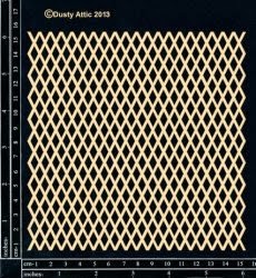
I have something a little different to share. I decided to use a whole sheet of the Dusty Attic large Argyle Panel as my background. This then allowed me to almost create a third dimension by adding papers to the back of the panel. It's kind of like having two backgrounds.


There are so many thing you could do with this panel. Try splatting paint across a piece of white cardstock and placing that behind it or try painting the panel a bold colour and put lighter colours behind. You could create some really interesting effects.

Once I had made my 'double background' I just created the layout on top as usual, however I kept the design fairly simple so it didn't get too busy. I used two sizes of the #3 banner which I painted in four Dusty in Colour paints. I added paper to some of the larger flags for a bit of variety.


I painted a Spider Chrysanthemum flower using the same paints as the banner and added a camera chippie which I painted black.


The Dusty Attic products used:
Argyle Panel large DA1010

Banner #3 DA1025

Spider Chrysanthemum DA1023

Mini Cameras DA1038

Dusty in Colour paints used:
Sunshine
Oceania
Sunburnt Orange
Capri


I hope you get the chance to have a play with this.

Happy scrappin'!

Heather 

Thursday, 6 February 2014

A Scrappy Adventure

Hi there. I hope you're not sweltering too much in this endless heat.

I've been having fun with a kit called "Magical Adventure". It's available at the Scrappy Chat Designs site here. I LOVE the papers in this kit! They are so versatile! And you get Goosebumps, Fireworks spray, Metallic Melts and a stencil. Yum!

I was really inspired by the Magic theme of the papers. The world's best magician (well we think so anyway) is a friend of ours and did us a favour by performing at my niece's party. He was amazing! I just had to make the layout about him.

Here it is:


I really worked with the papers on this one. I looked for sayings and pics that I could cut out of the papers - there were heaps of them to choose from.I layered them up ensuring I left some of the film strip showing to place my journalling on.


To see how I made that background go to the Scrappy Chat Designs blog. I've explained how this background only took me minutes to make. It's so easy!


The only things that weren't in the kit that I used to make this page were a couple of star punches and some black letters on the 'is for". The rest is all from the kit and I've still got oodles of products left.

I hope you can get a little magic from this kit too! If you'd like to order it just email orders.scrappychatdesigns@gmail.com


Have fun!
Heather


The New Look Scrapbook Creations

Well, after much anticipation, the new look Scrapbook Creations magazine is out! I have my copy already - don't you love subscriptions? - and it looks fabulous. And guess what? My work is in it!

Here's the front cover of the mag:


And here's a sneak peek of my project:


You can find the Scrapbook Creations blog here and a really cool digital sample of the mag here.

Cheers!
Heather

Monday, 3 February 2014

A Hot and Dusty Attic

Hi there,

As I write this it's stinking hot again. I love summer so I'm not really complaining but.....

Anyway, a cool breeze came in tonight so I scrapped away with the curtains billowing gently beside my scrap desk and a breeze wafting through. Wonderful!

What was also wonderful is that I was working on my February sketch layout for The Dusty Attic. Nadia provided a great sketch this month. Here it is:


I really wanted to use the new String of Hearts frame from Dusty Attic on this one so I switched the position of the circular element from that shown on the sketch. This chippie is popular among the ladies of the design team and they have already done such a terrific job with it so I thought I'd try to do something different. I wondered if it would suit a really modern, arty layout. Here's what I made:


There are a lot of Dusty Attic products on this page. I've used five different paints, Clear Gloss Varnish, the String of Hearts frame and three different diamond shapes.

To create the painted part of the background I applied four paints using four different methods:

1. I first swiped Oceania acrylic paint vertically over the page with an old credit card. This is my new fave colour - it's stunning!

 2. I then used the edge of the credit card to roughly apply Faded Denim paint.

3. When the others colours were dry (you might have to hurry that last thick application with a dryer) I then dabbed Jungle Green paint onto my fingertips and smeared it over the other colours.

4. I then applied a fourth colour, Alabaster, by simply running the nozzle of the bottle in lines down the page.

Dusty Attic paints dry really quickly, so they're perfect for mixed-media backgrounds.

Next I did a bit of stamping using blue and black ink and lineal and diamond stamps. I then sat the Small Trellis chipboard over the background and sprayed white Dylusions through it. White Dylusions doesn't sit well on acrylic paint and it didn't really give me the triangular shapes I was after but with such a mixed-media background as this one is, it doesn't really matter anyway. I then ran plain and zigzag stitching up and down the page.

The final step in the background was to add diamonds from the large and small Argyle Panels. I painted these with Alabaster paint and used the Clear Gloss Varnish to glue them as it's super-strong and has a lovely fine nozzle for small pieces like these. I painted the String of Hearts frame with Soot paint and added some watercolour hearts leftover from another project.

Here are some close-ups:


I don't usually use sentiments as titles on my layouts but Nadia's sketch used one and I thought this sentiment suited the page.

Here are the products I used:

String of Hearts Frame set DA1017

 Trellis small DA1032


Argyle Panel small DA1011

Dusty in Colour Clear Gloss Varnish DA0901

Dusty in Colour Oceania DA0912

Dusty in Colour Faded Denim DA0925

Dusty in Colour Jungle Green DA0920

Dusty in Colour Alabaster DA 0902

Dusty in Colour Soot DA0925

I hope you can create something special with this month's sketch! There are some extra goodies going out to this month's winner if you make your layout a Valentine's Day one.

Cheers,
Heather