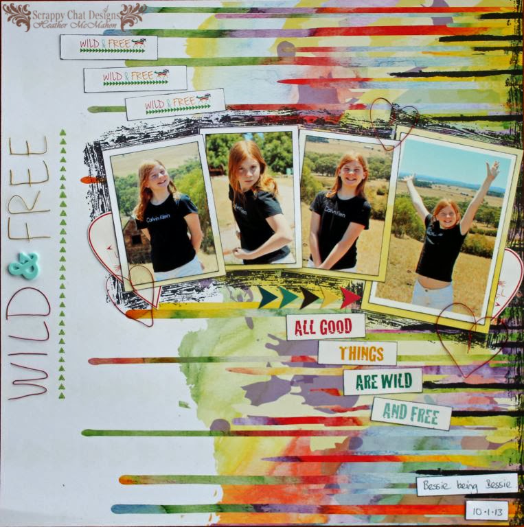
I have my second layouts made using Scrappy Chat Design's new Soaking It Up kit to show you. Some of the papers in this kit are from Glitz Design's Wild & Free range. In my layout, the name of the papers became the name of my layout.
Here it is up close. I've put this pic in sideways so it's easier to see.
It was really easy to make the words as the wire is so soft to work with. If you've never worked with wire before then I've put a brief step-by-step on my post on the Scrappy Chat Designs page.
The hardest part is attaching the letters to the page. You'll need to use a clear drying glue with a fine nozzle. It's also an option to stitch or staple it to the page, depending on what your design is and what you're attaching it to.
In the picture below you can see the brand name design. I've added three of them to the page to reiterate the Wild & Free theme. One of the Kaisercraft stamps that are also in the kit was perfect for forming the row of triangles under the name.
I also used the wire to form some hearts and used the heart from the sticker sheet as well. The borders around the photos are made with one of the stamps. I just inked up only the parts of the stamp that I wanted to use and carefully stamped around my photos. If I was only using one photo I would have done my stamping before I adhered the photos to the page but this was a bit tricky with four photos.
I love this 'drippy' paper and wanted to show it off. It's also quite a busy paper so I kept my embellishments to a minimum to allow the paper to shine.
Thanks for joining me.
Happy Scrappin'!
Heather


This is fabulous.. love the drippy look.. great photos and love the wire letters too...
ReplyDeleteThis is sooooooooooo gorgeous! LOVING that background paper you used and love love love the photos!!!!!!!!!!
ReplyDeleteThis is such a fun layout!! I love how you created your title with wire. Great stamping too!!
ReplyDeleteWild and free.....love it! This looks fabulous! Love the way you used the pp.
ReplyDeleteLove this page. The background is awesome
ReplyDeleteOh wow! Love love love the layout and what a smashing title with that super cool wire work!! Amazing!
ReplyDelete