Just a quickie - I'm off to the Scrapbook & Papercraft Expo in Melbourne on Friday. If any of you are going to be there please come and say hi. I would love to meet you in real life!
I've had a great week of scrapping. I've done a few layouts that I'm pretty stoked with. I'm just sorry I can't show them to you - you'll have to keep your eyes open in Scrapbooking Memories Magazine!
Happy scrappin'!
Heather

Wednesday, 27 February 2013
Friday, 22 February 2013
Tria Markers for Beginners
Hi there!
I hope you've all had a great week. I've been busy with the new Tria Markers I received from Katherine at Scrap Everything! They're very much like Copic Markers, but have some distinct differences.
Tria markers are alcohol ink based markers, perfect for colouring stamped images. A feature that separates them from the crowd is that you can produce darker and lighter hues of one colour all with the same pen. The more times you go over a coloured area, the darker it becomes. The advantage to this is that you only have to buy one pen to get all the shades of that colour you will need.
Here's what they look like - sorry about the low quality pic!

Another special feature is that they have 3 tips. One of the tips cleverly screws onto another. I'm not quite sure how the flow of ink works but work it does! There is a chisel tip, a medium tip and a very fine one for getting into those tricky places.
For those of you who have never tried them, here's Heather's Tria Markers for Beginners Tutorial:
1. Stamp your image with Memento ink. Any other ink will cause the image to bleed. You must stamp onto blending paper such as X Pressit brand for the alcohol inks to work properly - that is, blend and layer without bleeding.
2. Think about what direction you want the light in your image to appear to come from. You can use the marker to create shadows to give a more life-like look to your image.
3. Start with the lightest colours first. That way if you make a mistake you can hide it with the darker colour. Leave a faint line of white on the side the "light" is coming from to accentuate this. Colour in the remainder of that section with smooth strokes. It's best to use long, even strokes that cover the length of the section you are working on than shorter ones that overlap and leave marks. Here's my first layer on the face of a stamped image:

Note that you can see the stroke marks on this. These will fade as the image dries. See the white line I left on the right side? The"light" is coming from that direction.
4. Continue to colour your first layer across your whole image.

Notice how the stroke lines are fading on the boy's face.
5. Now add a second layer, keeping in mind that you are starting to create "shadows". I coloured about 3/4 of the boy's face and hair again. You can also darken areas to add contrast, for example to add more detail to clothing. Here's mine:

6. Now add a darker line down the side opposite the light source and add more shadows where required. Here's my final image:
 I took this pic as soon as I finished the picture which is why you can still see stroke marks. They have definitely gone now!
These images are great for cardmaking but I wondered how I could incorporate them into my scrapping. I coloured another image, cut it out and used it as a scrapping embellishment. I think it worked really well!
Here's my layout:

That little fairy girl is gorgeous. Here's a close up of her:
 You can see the contrasting colour around the hem of her dress. All the pink is just from the one pen. I adhered her to the journalling block then left her wings unattached. This made them stand up on the paper.
Off the subjects of the Tria Markers for a moment, I loooovvee the combination of that pink, peach and white laces. I'll be using that again.
I continued with the haberdashery theme by adding some embroidered flowers and leaves. My mum picks this sort of thing up at garage sales and they're always fantastic finds. I go rummaging through a bag of stuff she brings me and I never know what I'll find!

So if you're interested in giving the Tria Markers a go, you can find them here. If you would like more info, check out www.letraset.com where you can find some tutorials. Of course, good old you tube has tutorials too.
Hope you have fun playing!
Heather
I hope you've all had a great week. I've been busy with the new Tria Markers I received from Katherine at Scrap Everything! They're very much like Copic Markers, but have some distinct differences.
Tria markers are alcohol ink based markers, perfect for colouring stamped images. A feature that separates them from the crowd is that you can produce darker and lighter hues of one colour all with the same pen. The more times you go over a coloured area, the darker it becomes. The advantage to this is that you only have to buy one pen to get all the shades of that colour you will need.
Here's what they look like - sorry about the low quality pic!

Another special feature is that they have 3 tips. One of the tips cleverly screws onto another. I'm not quite sure how the flow of ink works but work it does! There is a chisel tip, a medium tip and a very fine one for getting into those tricky places.
For those of you who have never tried them, here's Heather's Tria Markers for Beginners Tutorial:
1. Stamp your image with Memento ink. Any other ink will cause the image to bleed. You must stamp onto blending paper such as X Pressit brand for the alcohol inks to work properly - that is, blend and layer without bleeding.
2. Think about what direction you want the light in your image to appear to come from. You can use the marker to create shadows to give a more life-like look to your image.
3. Start with the lightest colours first. That way if you make a mistake you can hide it with the darker colour. Leave a faint line of white on the side the "light" is coming from to accentuate this. Colour in the remainder of that section with smooth strokes. It's best to use long, even strokes that cover the length of the section you are working on than shorter ones that overlap and leave marks. Here's my first layer on the face of a stamped image:

Note that you can see the stroke marks on this. These will fade as the image dries. See the white line I left on the right side? The"light" is coming from that direction.
4. Continue to colour your first layer across your whole image.

Notice how the stroke lines are fading on the boy's face.
5. Now add a second layer, keeping in mind that you are starting to create "shadows". I coloured about 3/4 of the boy's face and hair again. You can also darken areas to add contrast, for example to add more detail to clothing. Here's mine:

6. Now add a darker line down the side opposite the light source and add more shadows where required. Here's my final image:

These images are great for cardmaking but I wondered how I could incorporate them into my scrapping. I coloured another image, cut it out and used it as a scrapping embellishment. I think it worked really well!
Here's my layout:

That little fairy girl is gorgeous. Here's a close up of her:

Off the subjects of the Tria Markers for a moment, I loooovvee the combination of that pink, peach and white laces. I'll be using that again.
I continued with the haberdashery theme by adding some embroidered flowers and leaves. My mum picks this sort of thing up at garage sales and they're always fantastic finds. I go rummaging through a bag of stuff she brings me and I never know what I'll find!

So if you're interested in giving the Tria Markers a go, you can find them here. If you would like more info, check out www.letraset.com where you can find some tutorials. Of course, good old you tube has tutorials too.
Hope you have fun playing!
Heather
Friday, 15 February 2013
My Masters Layouts
Oh I've been busting to get these layouts on my blog! At last I can put them up!
Yesterday, three of the Masters - Beck, Leonie and myself - caught up for the first time. I won't bore you with the details but we all brought our Masters layouts along and it was amazing how much better they all are in real life. I was blown away!
Now this might be a long post. I'm very proud of these layouts so I'll try hard not to rabbit on too much!

I love finding unusual items to scrap with and was thrilled when I found these acrylic flowers, buds and leaves at Spotlight. I used normal wire to form the frame then I simply twisted the wire stems of the acrylic flowers around the frame, after first stripping the stems of their silver foil covering.


To create the letter “A”, I first stamped on it with gesso
then coloured it with distress ink. I then coated it with Dimensional Magic. I
love the way this gives a multi-layered look on one simple letter.


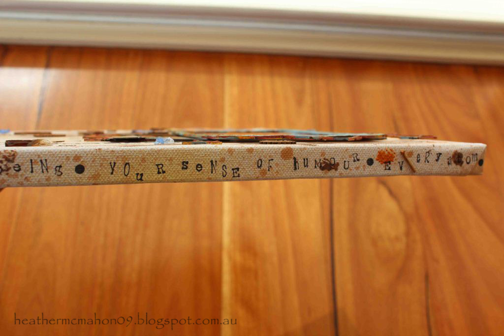
There was so much to tell that I decided to make pockets
behind each photo to keep the journaling in. I really wanted to use those old
packets of buttons but wanted to keep the layout uncluttered so I made tag
clusters, using a button packet at the back of each one. I love the wording on
the button packets – “Boilproof”, “Hot irons cannot hurt them”. I also added a
tag between the journaling and the buttons, just becau se
there were so many beau tiful paper
options and I wanted to use them all!


Yesterday, three of the Masters - Beck, Leonie and myself - caught up for the first time. I won't bore you with the details but we all brought our Masters layouts along and it was amazing how much better they all are in real life. I was blown away!
Now this might be a long post. I'm very proud of these layouts so I'll try hard not to rabbit on too much!

I love finding unusual items to scrap with and was thrilled when I found these acrylic flowers, buds and leaves at Spotlight. I used normal wire to form the frame then I simply twisted the wire stems of the acrylic flowers around the frame, after first stripping the stems of their silver foil covering.
Here are some close ups:


I had to ensure the clear acrylic pieces could be seen so I
kept the title cluster away from the frame and kept the layout fairly simple
for maximum impact. The filigrees and charm are from my2angels.

Next was the canvas challenge. We had to focus on texture.

This is probably the deepest I have ever gone in trying to portray feelings on a layout. I was trying to show that I love every part of my son.
I had had my eye on that fantastic rusty tin wall for a long
time and this was the perfect layout to use it as a background for my photo. I
wanted to extend the rusty tin look further across the page as well as provide
a place to add words about my son’s many parts so I printed another photo on
photo canvas for added texture then ran lines of glue from a glue gun behind the corrugations. If you run your finger over the photo printed on canvas you
can feel the “ridges” of the tin.

I added all sorts of things to help create the explosion effect including pieces of broken glass, rusty clocks and rusty pieces of the chipboard chicken wire. The chipboard frames with the chicken wire attached were great Twiddleybitz pieces. There is also paint and my ever faithful Tattered Angels Glimmer Mists.

I didn't want to leave the edges of the canvas blank so I added more words describing all the parts of my son that I love.
The next criteria was to make a layout that included at least 3 photos plus memorabilia. Here's what I came up with.

This is a beautiful story about how my daughter inherited a necklace from a favourite great-aunt. I wanted to keep this layout soft and feminine while at the
same time creating a glamorous, vintage look. My aim was to create a jewellery
box feel, using pearls and satin as features. Cream was my base colour but the reason I chose the aqua for my secondary colour is because the beautiful Manor House Creations flowers worked so well with it.
The photos sit on a pair of Twiddleybitz chipboard doors which I took from a mini album of theirs. And no, I don't work for Twiddleybitz!
To make the satin “jewellery box” section, I covered foam
with satin and secured it with brads topped with pearls. There are more filigrees from
my2angels here - and no, I don't work for them either!

Here's the inside:

My memorabilia is the original newspaper clipping of the wedding photo.

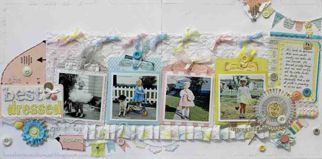
And last, but certainly not least, is the double. It had to be about our childhood. This is the hardest one to see both in the mag and on this blog.

This is possibly my favourite. It took me weeks to make!
Here's the first page:

And here's a close up:

My mum had previously given me a lot of her old sewing stuff. Some of the items were priceless – untouched packets of
buttons with the price in shillings and pence still on them, 50 year old
packets of hooks and eyes, old zips still in their packets and rolls of beau tiful lace. When I started looking at old photos
of me for this task and saw how I was always wearing home-made clothes, the
ideas for the layout just kept coming.
Here's the second page:

Here are some close ups:


How cute is this photo?
Here's the three layers of one of the tag clusters:


I hope you've enjoyed reading this. If you still feel the urge to read more about the Masters' layouts, the others Masters are all in the process of putting theirs onto their blogs. Links to their blogs can be found down the right hand side of my blog.
Have a great weekend everyone!
Heather
Tuesday, 12 February 2013
Scrapbooking Memories Update
Hi everyone,
Hope you've managed to get more scrapping done than me in the last week. Too much work and not enough play I say.
Here are a few layouts I had published recently. This one was in Scrapbooking Memories, Vol 15, No 2:
.jpg) This is one of those layouts you do just for the fun of it. With such a silly photo I had to make the page crazy too. The green lacy background is florists' mesh. You can get different colours and patterns - I think it's really versatile and adds a really interesting look. It's a bugger to stick down though! You really have to staple it.
This is one of those layouts you do just for the fun of it. With such a silly photo I had to make the page crazy too. The green lacy background is florists' mesh. You can get different colours and patterns - I think it's really versatile and adds a really interesting look. It's a bugger to stick down though! You really have to staple it.
This one was in Creating keepsakes, Issue 17.6:

I wanted to embellish the layout with circles, to mimic the wheels of the billycart, but also keep the layout old-worldly, to tie in with the old-fashioned feel of a billycart. I collected a few bottletops, hammered them flat then used them as bases for the Jillibean Soup cotton reel tops.
Hope you've managed to get more scrapping done than me in the last week. Too much work and not enough play I say.
Here are a few layouts I had published recently. This one was in Scrapbooking Memories, Vol 15, No 2:
.jpg)
This one was in Creating keepsakes, Issue 17.6:

I wanted to embellish the layout with circles, to mimic the wheels of the billycart, but also keep the layout old-worldly, to tie in with the old-fashioned feel of a billycart. I collected a few bottletops, hammered them flat then used them as bases for the Jillibean Soup cotton reel tops.
I printed the photos in increasing sizes and slightly
overlapped them to reinforce the message that Harrison is racing down the hill.
If you think some of those papers are pretty old, you're right! The layouts were made a while ago but I think if the papers look good, then keep using them!
Happy scrappin!
Heather
Thursday, 7 February 2013
Fire!
Hi all,
Well this is normally just a scrapping blog but we had quite a bit of drama today. A fire broke out about one kilometre from our house. Fortunately, the wind was blowing the fire more or less away from us but it was still very exciting - not necessarily in a good way!
We had three helicopters and a fixed wing plane circling around for ages. One of the helicopters was a fire fighting one - it's called Elvis. Elvis certainly saved the day. We watched in amazement as he picked up water from dams with his huge siphon thingy and dumped it on the fire again and again. He's like a giant mosquito!
We heard on the news that no houses were lost but they certainly dumped a heap of water on one house. They must have saved it.
As the fire was on the hill next to ours we had a great view of the whole thing. Here are some pics:
.jpg) A tree goes up in flames.
A tree goes up in flames.
.jpg) Elvis arrives to save the day.
Elvis arrives to save the day.
.jpg) They must mix fire retardant chemicals with the water as it comes out black.
They must mix fire retardant chemicals with the water as it comes out black.
.jpg) By now the fire is almost out .
By now the fire is almost out .
.jpg) You can see the burnt out paddocks and how close it was to houses. Friends of ours had to evacuate but from what we have heard, nobody was hurt apart from a firefighter who somehow injured himself (not from the fire).
You can see the burnt out paddocks and how close it was to houses. Friends of ours had to evacuate but from what we have heard, nobody was hurt apart from a firefighter who somehow injured himself (not from the fire).
Well that's enough excitement for one day! I hope everyone else is keeping safe from the various fires and floods that keep threatening us. What an interesting country we live in!
Hugs to all,
Heather
Well this is normally just a scrapping blog but we had quite a bit of drama today. A fire broke out about one kilometre from our house. Fortunately, the wind was blowing the fire more or less away from us but it was still very exciting - not necessarily in a good way!
We had three helicopters and a fixed wing plane circling around for ages. One of the helicopters was a fire fighting one - it's called Elvis. Elvis certainly saved the day. We watched in amazement as he picked up water from dams with his huge siphon thingy and dumped it on the fire again and again. He's like a giant mosquito!
We heard on the news that no houses were lost but they certainly dumped a heap of water on one house. They must have saved it.
As the fire was on the hill next to ours we had a great view of the whole thing. Here are some pics:
.jpg)
.jpg)
.jpg)
.jpg)
.jpg)
Well that's enough excitement for one day! I hope everyone else is keeping safe from the various fires and floods that keep threatening us. What an interesting country we live in!
Hugs to all,
Heather
Friday, 1 February 2013
Photo Freedom and Echo Park
Hi Everyone,
Well I'm back from holidays and have had fun sinking my teeth into the new Echo Park range for Photo Freedom. Katherine from Scrap Everything! sent me a pack of the new range called Happy Little Moments. The whole concept is based around creating fast, efficient albums that look great even if you don't have an artistic bone in your body.
The pack contains 5 photo sleeves, each with a different arrangement of pocket sizes, 5 sheets of paper, some of which are sized to fit the photo pockets plus a sheet of stickers. I found this to be ample to create 10 individual pages. If you tend to use all one size photos, say 4 x 6 inches, you can buy the sleeves that just fit those photos.
Here's my first page:

My brother and his family came to see us in January. We don't see each other very often so it was great to spend so much time together. I chose to use one of the 12 x 6 inch journalling blocks on this page so I could tell the story.
Here are pages 2 and 3:

You can see how there are plenty of pocket size options to slide your photos into. When a particular photo orientation doesn't work, just print two say, portrait photos onto one landscape 6 x 4 size photo like I did in the pic in the bottom left-hand corner.
There are plenty of options for "bumping up" the dimensions on the pages if you want One option is to simply wrap twine or ribbon around a journalling block like I did here:

Here are pages 4 and 5:

I tried to keep all the "silly" photos on one page but there were so many that they spread further. What does that say about my family?
Here are some other ways to bump it up if you prefer:
 Try adding items to the outside of the plastic pockets like these tags.
Layer a 3 x 4 sentiment onto a 6 x 4 journalling block and add some texture with ribbon and lace:

Add extra dimension with foam tape:

Here are pages 6 and 7.

Adding stickers adds interest but still allows the pages to sit flat:

The last double page is this one:

Again, I've used two photos to fill one 6 x 4 pocket in the top left hand corner.
The last page is a 12 x 12. Here's a better pic:

I used some of the leftover journalling blocks and papers to make the flowers. The natural colour of the chipboard leaves worked well with the paper colours. Here's a close-up:

I added some pearls and some brads to this page.

On all the pages I only added ribbon, twine, some letter stickers and ink. All the rest of the products are from the Echo Park set.
If you've got this far reading this mammoth post then you're probably interested to know what I thought of these products!
Pros:
Well I'm back from holidays and have had fun sinking my teeth into the new Echo Park range for Photo Freedom. Katherine from Scrap Everything! sent me a pack of the new range called Happy Little Moments. The whole concept is based around creating fast, efficient albums that look great even if you don't have an artistic bone in your body.
The pack contains 5 photo sleeves, each with a different arrangement of pocket sizes, 5 sheets of paper, some of which are sized to fit the photo pockets plus a sheet of stickers. I found this to be ample to create 10 individual pages. If you tend to use all one size photos, say 4 x 6 inches, you can buy the sleeves that just fit those photos.
Here's my first page:

My brother and his family came to see us in January. We don't see each other very often so it was great to spend so much time together. I chose to use one of the 12 x 6 inch journalling blocks on this page so I could tell the story.
Here are pages 2 and 3:

You can see how there are plenty of pocket size options to slide your photos into. When a particular photo orientation doesn't work, just print two say, portrait photos onto one landscape 6 x 4 size photo like I did in the pic in the bottom left-hand corner.
There are plenty of options for "bumping up" the dimensions on the pages if you want One option is to simply wrap twine or ribbon around a journalling block like I did here:

Here are pages 4 and 5:

I tried to keep all the "silly" photos on one page but there were so many that they spread further. What does that say about my family?
Here are some other ways to bump it up if you prefer:

Layer a 3 x 4 sentiment onto a 6 x 4 journalling block and add some texture with ribbon and lace:

Add extra dimension with foam tape:

Here are pages 6 and 7.

Adding stickers adds interest but still allows the pages to sit flat:

The last double page is this one:

The last page is a 12 x 12. Here's a better pic:

I used some of the leftover journalling blocks and papers to make the flowers. The natural colour of the chipboard leaves worked well with the paper colours. Here's a close-up:

I added some pearls and some brads to this page.

On all the pages I only added ribbon, twine, some letter stickers and ink. All the rest of the products are from the Echo Park set.
If you've got this far reading this mammoth post then you're probably interested to know what I thought of these products!
Pros:
- Very quick to put an album together. There are a whopping 37 photos on these pages! If I hadn't have used this system those photos would still all be sitting on my computer.
- I love the colours of this range. They would work well with many styles of photos.
- The pack, which included the pocket pages, had just the right quantity of items.
- There are other ranges available as well. The ones I've seen look great.
Cons:
- Some of the double sided 6 x 4 journalling blocks didn't line up exactly with those printed on the back. This could have just been in my pack or might be an issue with all the papers, I'm not sure.
- Sometimes it can take a bit of fiddling to make your photo orientations work to suit the pockets.
Tips:
- Don't ink the edges of anything! I began inking the edges of my photos before I realised I'd fit so many photos in! It took ages and defeated the purpose of this system, which is to scrap in a time-efficient manner.
- Keep your pages as simple or as fancy as you like. Keep in mind you can't put too many lumpy-bumpy embellishments in the pockets though.
- Don't be afraid to embellish the outside of the pockets or to extend embellishments beyond the edges of the pages.
- The stickers are great for placing in blank spaces on photos.
- There are plenty of journalling blocks - use them! An album full of photos without journalling will mean nothing to others in future years.
If you decide that this style of scrapping is for you then be prepared to get a lot of photos scrapped. It's a great time-saver!
Til next time,
Heather
Subscribe to:
Posts (Atom)