I hope your week has started well. If it's school holiday time for you then I hope you're getting a few sleep ins!
I was checking out the amazing work of Georgia Heald the other day on her blog and saw she was this month's guest designer for a Russian challenge site called Paperdvizhnik.. Georgia says the site has a lot of arty, mixed media layouts so I thought "this is for me!" This months' challenge is to create a layout using white, grey and two other colours of your choice. Here's what I came up with:
I chose the pink colour to match my daughter's sunglasses and I was inspired by a lovely old K & Company paper to make the second colour that gorgeous yellow-green. The weird thing is that I then hardly used any of the paper!
I had fun creating the background. I used a tried and true Heather technique - if you're not happy with it, gesso over the top and keep going! I first used texture paste through a TCW stencil to create the lines of dots. I then sprayed carefully behind the photo with Dylusions so it would colour some dots pink and not others. I coloured some of the other dots grey with an ink pad and left some white. I then added quite a bit of stamping using grey ink.
I then decided that I wasn't completely happy with the effect so I gessoed over the top of it, leaving some parts partly exposed. I now had a background with depth and texture to work with. The Dylusions softened and blended when it was wet with the gesso and the other colours were toned down. Now, I was happy with it! I then took another TCW stencil (Mayan Calendar - one of my favourites) and used multiple inks to match the colours of the paper. I used mustard seed and crushed olive Distress Inks to make the yellow-green and pink and purple inks to make the pink colour.
You can see the layers here:
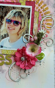
I added a chippie, some Manor House Creations flowers and A Lil' Somethin' flair button to finish off the photo:
I made a pair of shades from paper and created the title with some ever-faithful Thickers.
I used another stencil behind the photo - this time a Maya Road one - and added some grey to it.
I finished the page off with some stitching in grey, pink and green and added the leftover threads to the chipboard flourish.
If you're into mixed-media layouts, hop on over to Paperdvizhnik and have a look. I'll keep an eye open to see if you post a layout there!
Cheers,
Heather


Now HOW cool are those shades and how you've used them in your title! really really love your delish background work! xoxo
ReplyDeleteThis looks fabulous Heather, I love how you have created the title and your back ground looks wonderful!!
ReplyDeleteFantastic layout! Dynamic and I love your "Heather" technique! :)
ReplyDeleteThis is gorgeous!! I loveeeeeeeeeee the colors, the flowers and LOVING the shades in the "cool"!!!!
ReplyDeleteWow! This is fabulous! LOVE your background...looks awesome! Those shades are soooooooooooooo sweet!
ReplyDeleteGreat cups...really show the detail & the subtle colours on the masking...loooove adore am in awe of you using the sunnies in your title.....such an outside the box thinker you are:):):):)
ReplyDeleteGreat design. Simply adorable daughter!
ReplyDeleteThis is fantastic Heather!!
ReplyDeleteLove love love the colour, texture and layers in this one! such a beautiful layout!
ReplyDelete